— Mobile Application Redesign
FordPass / LincolnWay Dashboard
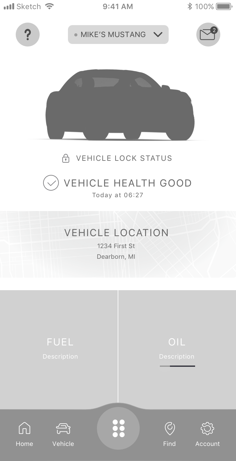
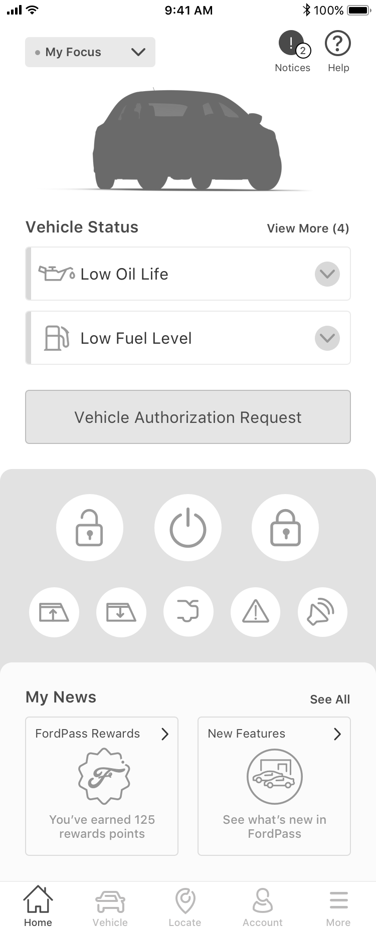
The purpose of this study was to assess the functionality and users’ emotive experience of the FordPass Move Landing Page (For consumers). Specific areas for evaluation for both included: user performance, understanding, and emotional reactions in addition to logic/flow, user experience and reaction to proposed features.
Client
Ford
Date
Summer/Fall 2019
Duration
4 Months
Focus
User Engagement (Features)
UX Research
Prototyping
Information Architecture
UI Design
Participants
Locations - London, England and Berlin, Germany
Sessions
— The Challenge
Challenge & Solution
The most difficult aspect of the app was finding the vehicle’s location, oil change coupon, recalls, roadside assistance, an authorization request, and general announcements from Ford. Users struggled with these tasks because they were not located where users expected and required too much work to find.

What worked well
Users were very excited by many of the features in the app. Users appreciated the ease of understanding and the ability to access important and frequently used functions and features, such as checking fuel level, locking/starting their vehicle, and switching vehicles from Home. Users were especially satisfied when icons and paths were intuitive.
Preference
Users were split in their preference, most notably because each prototype brought with it elements that users liked and disliked. Typically it came down to preference for easy access to controls or vehicle information (oil, fuel, etc.)


